project one - midtown madness
the deep end
The assignment was straightforward: a women-in-tech organization is holding a gala and is sending out street teams to New York subway stations to gather commuters’ email addresses. My team (Christian Buerkle, Dave Salorio, and myself) had about four afternoons to figure out where.
In order to do data science, it helps to have some data. Metis didn’t give us any. But we knew we needed MTA data, and a Google search for ‘mta data’ turned up live data meant for app developers, not immediately useful to us, and the weekly turnstile data we grew to know and love.
Typos in two of the eleven column names in the minimalist data documentation did not inspire confidence in the MTA’s attention to detail. After five minutes of fruitless searching for ‘cleaned mta turnstile data’ and ‘mta clean data where’ and ‘mta data someone already processed please google give it to me’ we decided that the turnstile files were as good as we were going to get.
the data
Each turnstile file is a very long CSV (comma-separated values) of around 200,000 rows. We read one into a pandas DataFrame and started picking it apart - looking at the unique values for each categorical column, the ranges for each numerical one, and how the columns and rows seem to relate to one another. We eventually figured out that each row corresponded to:
- a single turnstile
- in a single station
- at a single point in time, usually1 four hours apart.
Turnstiles were identified by three columns (C/A, UNIT, and SCP), stations by another three (STATION, LINENAME, DIVISION) and time stamps by two (DATE, TIME, both strings, which we quickly converted to a python datetime object). There was also a mysterious DESC column, which was REGULAR for the vast majority of rows, and RECOVR AUD for a very small handful. The documentation explained that these were ‘missed audits that were recovered,’ and we decided not to worry about them for the time being, since they otherwise looked OK.
Finally, the good stuff: the ENTRIES and EXITS columns, which contained the cumulative register of the number of people who had passed through that turnstile at that moment in time. These were apparently pretty straightforward - all we had to do was convert these to the number of turnstile turns per time period, and we were in business!
we’re not in business
Converting cumulative counts to row differences (i.e., new entries/exits per four-hour time period) was pretty simple, thanks to Dave’s helpful knowledge of the DataFrame.shift method. But when we looked at the extreme values of the results, we found some weird junk:
- Negative values: over a thousand of ‘em
- Insanely large values like 589,801
- Insanely negative values like -3,507,316
In order to figure out what was going on, we took a closer look at the surrounding data for each of these. We guessed that the insanely large values were caused by counter resets (rolling back to zero), but this turned out to not be the case: instead, for each of these, it appeared that both entries and exits simultaneously jumped to completely different values at the same time! Apparently the MTA staff were just going around, occasionally moving turnstile components from one station to another, with blatant disregard for the poor data scientists trying to use this data.
Luckily, there were only a handful of these - about a dozen per week, out of 200,000-odd entries - so they could simply be zeroed out without any ill effect on the overall totals we were going to calculate. We decided on a cutoff of 15,000, based on both the legitimate-looking data (which maxed out at around 4,000 or 5,000) and a rough calculation of the maximum conceivable number of humans that could blast through a turnstile if their lives depended on it (1 per second x 60 seconds x 60 minutes x 4 hours = 14,400).
The negative values were more interesting, since most of them looked like correct values (in the 0 to 3,000 range), only negative. And there were enough of them (more than 1,500) that it seem worthwhile to try to keep them. When we looked at single-turnstile data for these values, we found that it was always both entries and exits that simultaneously counted down instead of up, and that the data otherwise looked fine. Thinking about how a physical turnstile actually worked, we decided that someone at MTA had probably just installed the turnstile counter gizmo backwards, and that we could preserve this data by simply taking the absolute value.
With our clean(er) entry and exit data in hand, now we could finally start aggregating by subway station and time period, and see if the data made sense. Results were encouraging: the stations with the highest daily and weekly traffic were all ones even a dope like me had heard of, like Penn Station, Grand Central, and Times Square. Looking good!
analysis plan
Obviously, one week of data wasn’t going to be enough. We decided to grab the entire previous year’s worth of data - 52 files - to work with. Because we wanted to learn data science, not clicking science, we spent an hour and a half writing a python program to automatically scrape the MTA website for data between any two YYMMDD date strings (provided they exist). This would also help in case we wanted to download even more data later.
Later on, we found out that an entire year’s worth of data was unwieldy and unnecessary, and we decided to just use data from the last three Aprils, plus this year’s March for good measure. But at least we wrote some neat code!
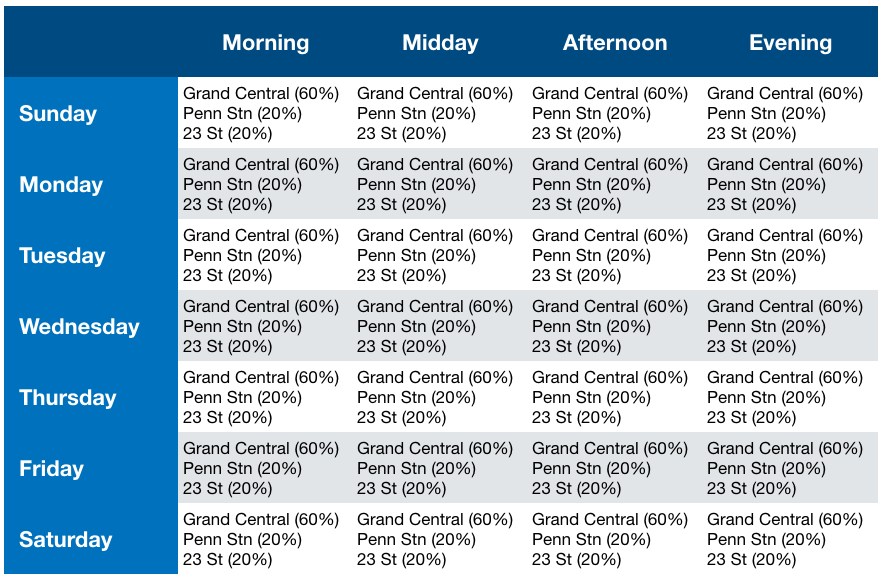
More productively, we thought about what we wanted our final product to look like. Charts and graphs are cool, but did they really tell our fictional client what they needed to know? All they cared about was where to send their street teams, and when. I envisioned something like this:
In order to create this, we needed to reshape our data into something with the following columns:
- A unique subway station ID
- Day of week
- Time of day
- Clean entry and exit counts per station and time period
For the first item, we realized we couldn’t just use the STATION column in our data, since there are multiple stations that share the same name, and these names (like 23 ST) can identify multiple stations, some of them not even near each other. We created a tuple of STATION and LINENAME to serve as the unique identifier. Running DataFrame.nunique() confirmed that this was the right approach, yielding 472 unique combinations, exactly the number that pops up when you highly scientifically Google for ‘number of new york subway stations.’
It was helpful to have Christian on our team here as well, since he had lived in New York and could quickly tell us if our data made sense. For example, one of our early Minimum Viable Product graphs listed Aqueduct / North Conduit Av as one of the busiest stations in the system - Christian took one look at that and knew that had to be wrong.
Getting the day of week was pretty simple, since we had already processed our dates and times into a datetime object - the weekday method returns an integer from 0 (Monday) to 6 (Sunday), which was easily mapped to strings.
Time of day was more interesting. Most of the data was collected in four-hour increments starting at midnight or 1:00 am (thanks, daylight savings), but some starts at 2:00, some at 3:00, and some at weird times like 12:22. Because of the variation in start times, and the low time resolution, we decided to give up on our fantasy of four time periods and just look at morning (defined as time blocks starting between 3 and 9 am) and evening (blocks starting between noon and 5 pm). We also noticed very little difference between e.g. Monday and Tuesday, so we aggregated (using the median) our seven categories of days of the week to two: weekends and weekdays.
the tourist factor
One of our client’s wishes was to make sure we target local New Yorkers, who would actually be around to attend the gala, rather than tourists. It was suggested that we could examine the difference between weekend and weekday traffic to figure out which stations were more likely to be primarily used by commuters.
Obediently, we took our weekend/weekday aggregated data and divided median weekday by weekend traffic to get a ‘commuter-ness’ score. This ratio varied from 0.65 (Aqueduct Racetrack station, which was one of two stations busier on weekends than weekdays) to 11.84 (Hunters Pt Av, with almost no weekend traffic at all). Initially, we thought we would simply multiply each station’s traffic by this ratio to get a dimensionless weighted score, but the huge range of values made the weight a little too heavy for our purposes. To ‘soften’ it, we took the natural log of the ratio and used that as our multiplier instead. Not very scientific, but we haven’t officially learned any real statistics yet.
putting it together
When we started this project, we had all kinds of big dreams about incorporating census data, classifying stations based on whether they’re in tech hotspots, and lots of other fabulous ideas. But just learning how to do basic things in pandas, like filtering by specific stations, or grouping without losing columns, took up a lot of the time we wanted to spend on extras.
What we had, which was better than nothing, was the tourist-adjusted traffic for each station, over two dimensions: weekend vs. weekday, and morning vs. evening. We decided to focus on weekdays (since, after all, we wanted commuters, not tourists), and created simple top-ten lists of stations for morning and evening. But these lists didn’t convey the relative value of each station, so we created as-simple-as-possible bar charts of the traffic scores and put everything together in Keynote:
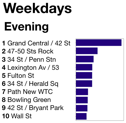
(Additional charts were created for weekday mornings and weekend evenings.)
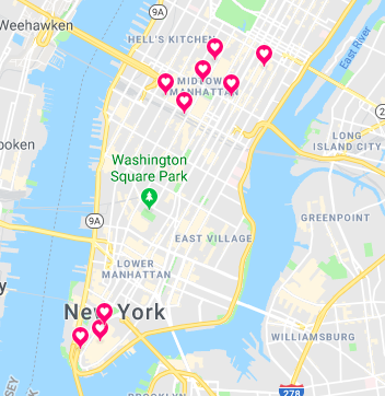
We also threw in a cute map of these ten stations, because everyone loves maps:
the moral of the story
As underwhelming as our final product seems, we learned some useful lessons:
- the data is never as clean as you think
- decide what you need before you go crazy collecting stuff you won’t use
- expect to trim back on your big plans
- it helps to have some local or domain-specific knowledge of the thing you’re data sciencing
The end!!
-
very occasionally, there would be a series of timestamped rows in quick succession, with only a few minutes or seconds between them - this ended up not affecting our analysis, but it was pretty weird. ↩